Urban signage is not an aesthetic detail. It guides quick decisions, prevents risks, and gives autonomy to those who move around the city.
When language is confusing or symbols make no sense, the space becomes exclusionary — especially for people with disabilities, older adults, tourists, and those who do not speak Portuguese fluently.
Why plain language and pictograms matter in the city
On the street, no one reads calmly. Information needs to be understood in a few seconds, often from a distance, under sun, rain, or noise. Plain language reduces cognitive effort; pictograms broaden reach for people with low vision, reading difficulties, or language differences.
Inclusive signage is not an “extra”: it is part of the city’s basic functioning.
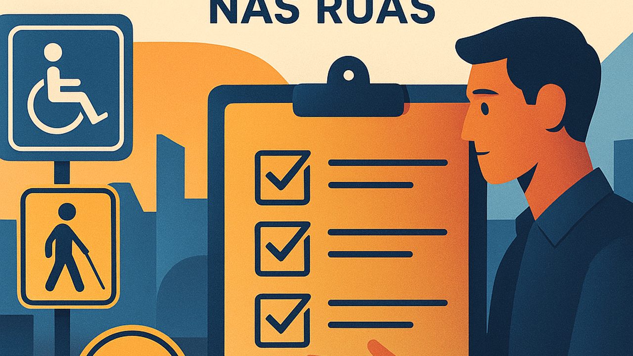
Checklist 1: Clear, direct, and predictable language
Before looking at the sign’s design, it is worth reviewing the text. It is often the first obstacle.
- Short sentences, with direct order (verb + action) - Common everyday words, avoiding acronyms and technical terms - One main piece of information per sign - The same term for the same action throughout the area (e.g., always “Accessible restroom,” never variations)
In Brazilian urban environments, predictability helps a lot. Changes in vocabulary confuse people, even when the intention is good.
Attention to size and contrast
Plain language does not work if no one can read it:
- Sans-serif font - Letters large enough for distance reading - High contrast between text and background (black/white, blue/white)
Checklist 2: Recognizable and consistent pictograms
Pictograms should complement — not completely replace — text. They speed up understanding and help those who do not read fluently.
- Symbols widely recognized in Brazil - Simple drawings, without excessive detail - The same pictogram for the same function along the entire route - Avoid overly “creative” icons that require interpretation
A good test: does the person understand the symbol in less than two seconds? If it needs explanation, it does not work.
Beware of common ambiguities
Some recurring errors in urban signage:
- Icons that are too small - Similar symbols for different functions - Pictograms without context (e.g., an arrow without indicating what or where)
Checklist 3: Placement, height, and strategic repetition
Even the best sign fails if it is poorly positioned. Accessibility is also about being in the right place.
- Visible height for people standing and seated - Avoid obstructions such as poles, trees, or advertisements - Repeat information at decision points (intersections, entrances, route changes) - Place signs before the action, not after
In the city, people need to decide quickly: turn, cross, enter, or continue.
Integration with other accessibility resources
Whenever possible, visual signage should work together with other supports:
- Tactile paving guiding to the sign - Good nighttime lighting - Consistency with audible warnings or traffic signals
The combination of resources reduces errors and increases autonomy, even when one of them fails.
How to use this checklist in everyday urban life
This checklist can be used to assess sidewalks, plazas, terminals, stations, and high-traffic areas. It can be used by managers, maintenance teams, or anyone who wants to identify barriers and demand improvements.
Inclusive signage does not draw attention to itself. It simply works — and when it works, the city becomes easier for everyone.
Comments
Comments are public and the sole responsibility of the author. Don’t share personal data. We may store technical signals (e.g. IP hash) to reduce spam and remove abusive, illegal, or off-topic content.